


Ok, maybe your thumb won’t turn green, but this app will help answer your plant-related questions.
Have you ever tried growing tomatos only to come to find out that all of your efforts bore no fruit?

Or, how to keep pests from eating your harvest before you had a chance to taste it?

What if you could get some real-time sage advice to help you take better care of your plants and garden, and debug your problems? This is the main design of the BeanPod app: Advice from expert horticulturists through live video sessions.
Who Did What, and How
This was a solo design project, so my role included user research, interviews, competitive analysis, design, usability testing, etc.
Tools Used:
Optimal Workshop (for the research)
Figma (for the wireframes and prototyping)
Lyssna (for the testing)
Possible Competitors?
Smart Plant Home
Plant care
Text-based chat with experts
Symposium
Video sessions
Broad category of topics/fields
Allow anyone to sign up and become an expert
But…There is an opportunity for us in this market if we combine live-video sessions with curated experts along with plant care/gardening specific information in order to provide a unique and informative experience for users interested in gardening.

Understanding the User
Interview Goals
Understand users’ pain-points and needs about gardening
Identify resources users use to manage their gardening tasks
Understand user’s attitudes towards using and receiving information from online resources

Interview Questions
How did you get started in urban gardening?
What resources did you use to learn about gardening? Why did you decide to use these particular resources?
Which approach to learning did you feel was most helpful, or most comfortable? Why?
What do you enjoy most about urban gardening? Why?
What types of tasks do you perform in your garden?
What gardening issues have you encountered? How did you go about resolving them?
What resources or methods did you find most helpful in resolving those issues? Why?
Why were the other resources and methods not as helpful?
If you were to teach someone else about urban gardening, how would you do it? What medium would you use?
What is your view on online learning?
What is your experience with communicating with an online assistance or customer support representative?
User Research Analysis
From interviewing the participants and using affinity maps to organize my notes, I was able to conclude that there is a great interest in finding a reliable and easily accessible source of information about gardening.
Participants enjoy watching plants grow and produce results that are either edible or visually appealing
Learning through social interaction is enjoyable and provide more useful information than online research alone
Some participants prefer to do their own research and perform trial-and-error experiments
Online gardening groups provided useful non-professional information, but requires trial-and-error to verify the results
Talking with knowledgeable gardening professionals usually provided useful and reliable information and opportunity to learn
Most participants would only use the information from video sessions with an expert if all other means and resources have been exhausted
Participants are open to online learning, provided it is accessible, easy to use and navigate, and the information is relevant and reliable
Personas
Based on the information from my user research, I created two personas to help me focus on the users while working on the design. Each persona has a different mindset and approach to gardening, but together encompasses the goals and needs of the users.


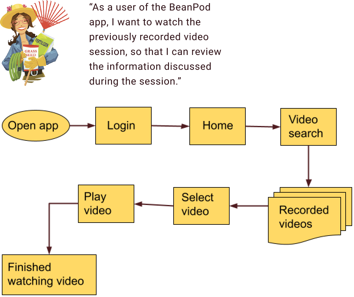
User Flows
A user flow helps to create a map of the set of pages in an app that a user must interact with to complete a task or achieve a goal while using the app. Based on the needs and goals of my personas, I created a few user flows in order to help make my design more user-centered and make sure every need of the personas have been satisfied at every point in the user flow.


Ideation
Wireframes and Prototypes
I started by creating low-fidelity wireframe sketches of pages for my app based on the user flows. Using Figma, I converted the sketches to mid-fidelity wireframes and created a prototype for usability testing.

Flow for plant search

Flow for scheduling call with mentor

Flow for watching recorded video call

Usability Testing
Goals
The goal of this study is to assess the learnability for new users interacting with the BeanPod app for the first time on mobile devices. I wanted to observe and measure if users understand the app, its value, and how to complete basic initial functions such as logging in, navigation, searching for information, and consulting experts.
Findings
The study consisted of 6 participants
4 of the sessions were conducted remotely via Zoom and recorded
The remaining 2 sessions were conducted in-person using a laptop and recorded
5 out of 6 participants complete all given tasks
One participant was not able to complete the task to start a call with an expert
5 out of 6 participants agreed that the task to start a call with an expert was more difficult than other tasks according to the Single Ease Question 7-point rating scale
Objectives
Features tested:
Finding information on plants
Scheduling a video session with an expert
Watching previously recorded video sessions
Objectives:
Observing how participants navigate and perform each task using the app, and where the frictions are
Determine if the participants can easily understand what the app is about
Is the design easy and/or intuitive to use?
Analysis
I once again used affinity maps to help group and organize my observations and notes taken during each session. The usability tests helped reveal the pain points and errors the participants had encountered while using the prototype. I captured these takeaways from the usability tests in a Rainbow Spreadsheet (shown below) to help me rank the errors and determine next steps.

Iterative Design
Login Page
My design for the login page improved the most from usability and preference testing. The results helped with determining the color schema and theme of the background images. I was uncertain whether to include a splash page for the user to log in or sign up, and ultimately went with a login page with a sign up link underneath instead. Designing for accessibility also helped to improve the form fields and color contrasts.

Homepage
I added icons for the bottom navigation bar, and made subsequent improvements by using the Material Design system and guidelines. Including a background image based on preference testing also helped make the homepage more visually friendly and inviting to the user.

Plant Search Page
I added images and used cards to create different plant categories. Adjusting and fine-tuning the whitespace between the cards and other components helped to create a hierarchy of information that is organized and cohesive.

Mentors Page
My initial design using a carousel to contain a brief summary of mentors caused too much cognitive load for the user. More so if there is a large list of mentors. I made improvements by using vertical scrolling of cards with just the mentor’s name and specialty. Tapping on a mentor card transitions to a page with more details on that particular mentor. From user testing and peer reviews, I added a search field to help the user narrow down choices of mentors.

Calls Page
The calls page is the most difficult for me in terms of creating a design that would allow the user to view upcoming and completed/canceled calls. Initially I had a button to allow the user to book calls from this page, but removed it after user testing. I experimented with horizontal scrolling of cards, but changed to vertical scrolling after user testing. I’ve also replaced the ellipses and overlays with buttons in each card.

Final Prototype

Retrospectives
Takeaways
I learned a great deal about user-centered design process from doing the research and design for this case study. I’ve enjoyed every step from talking with users to gain insight into their goals, needs, and pain points and creating personas to the visual design of the wireframes and prototypes.
A few additional things I’ve learned along the way:
Design systems greatly help speed up the visual design
Users are more comfortable using a new app if the design uses common or well-known icons, hierarchy, and flows and helps to reduce cognitive load
Better color contrast improves the visual design and accessibility
Good spacing of components and use of whitespaces helps create consistency, information hierarchy, and makes it easier for the user to consume the content
Reduce user cognitive load by showing brief information and allow the user to drill down for more details
Next Steps
Add error handling, such as what message is displayed to the user when invalid information is entered
User flow for canceling a mentor call
Process and user flow of setting up user payment options
Menus and settings layout and hierarchy (e.g., logging out)
User flow for searching by plant categories
New hypotheses:
I believe that by adding a chat feature to enable users to write text messages to mentors, we will achieve increased usage of the app and a better learning experience for the user. We will know the above hypothesis to be true when we see users logging into the app more often, and continual interaction between the user and mentor.